Rebuilding Donation Processing Around the Work
I redesigned and built Chariot's donation-management workflow, replacing a transaction-centered interface with four stages modeled on how nonprofit officers worked. The shipped experience brought a multi-application process into one interface and reduced observed processing time from 5–7 minutes to about 3 minutes per donation.
One donation required four different tools
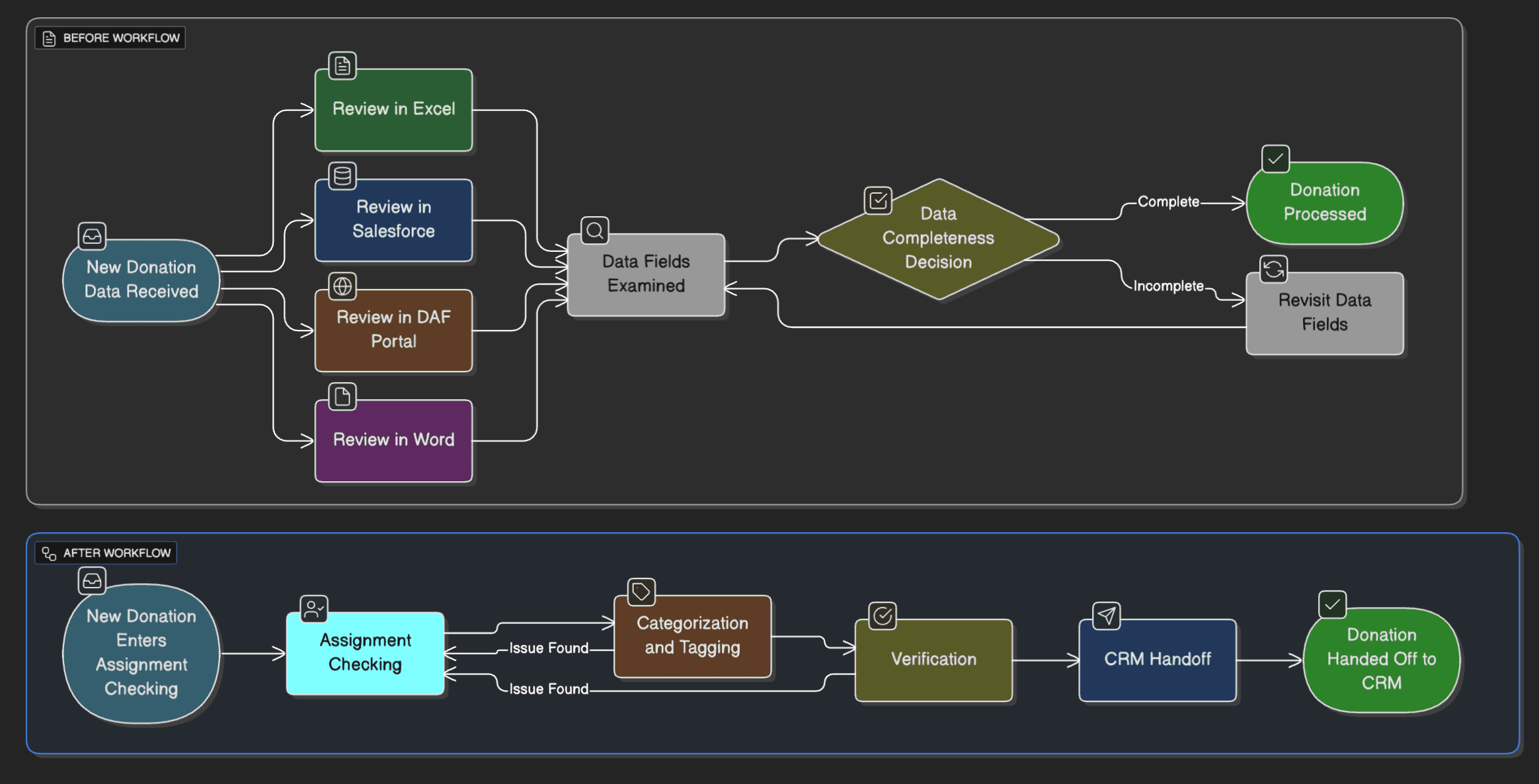
Nonprofit officers processed donations across Excel, Salesforce, Word, and several DAF provider portals. Reviewing one donation meant locating its assignment, checking donor history, categorizing it, recording notes, and updating status across systems that did not share workflow context.
While DAFpay provided richer donation data than traditional donor-advised-fund payments, the first interface primarily made that data visible. Officers still had to remember what had been completed and decide what came next. The product needed to represent the work, not only the transaction.
Product challenge
How might we let officers review, classify, and hand off a donation without reconstructing its status across several applications?
”I'd spend my entire morning just on donations — opening Excel to see what's assigned to me, then switching to Salesforce to check donor history, then back to Excel to update status, then to Word to write notes. By the time I finished processing 10 donations, half my day was gone and I hadn't even started on my actual fundraising work.”
Development officer, nonprofit organization
The workflow model changed before the interface did
Mapping the before and after made the product decision explicit: replace a tool-based loop with four states that described the next action.
Design the interface around the next action
The redesign translated that workflow model into five product decisions:
- Four workflow stages that reflected what officers needed to do next, rather than how donation data was stored
- A contextual detail panel that kept donation information and actions beside the task list
- Optimistic transitions that updated tabs and counts immediately and preserved an Undo path
- Assignment and filtering controls that let officers focus on their responsibilities and redistribute work
- One interface for work previously split across Excel, Salesforce, Word, and DAF portals
Finding the right model before refining the UI
The first build exposed transactions, not the work
Our initial "Transactions" interface organized the available data cleanly, but feedback from nonprofit officers showed that it still left them to reconstruct the status of each donation. I made the case for stepping back from the table we had built and redesigning the product around the sequence of decisions officers needed to complete.
Officers organized the work by state
In sessions with nonprofit officers, I traced the work across Excel, Salesforce, Word, and DAF portals. Four stages appeared repeatedly: assignment checking, categorization and tagging, verification, and CRM handoff. Officers thought in terms of "what needs to happen next?" rather than "what fields does this donation contain?" That distinction became the interaction model for the redesign.
Four stages replaced one undifferentiated table
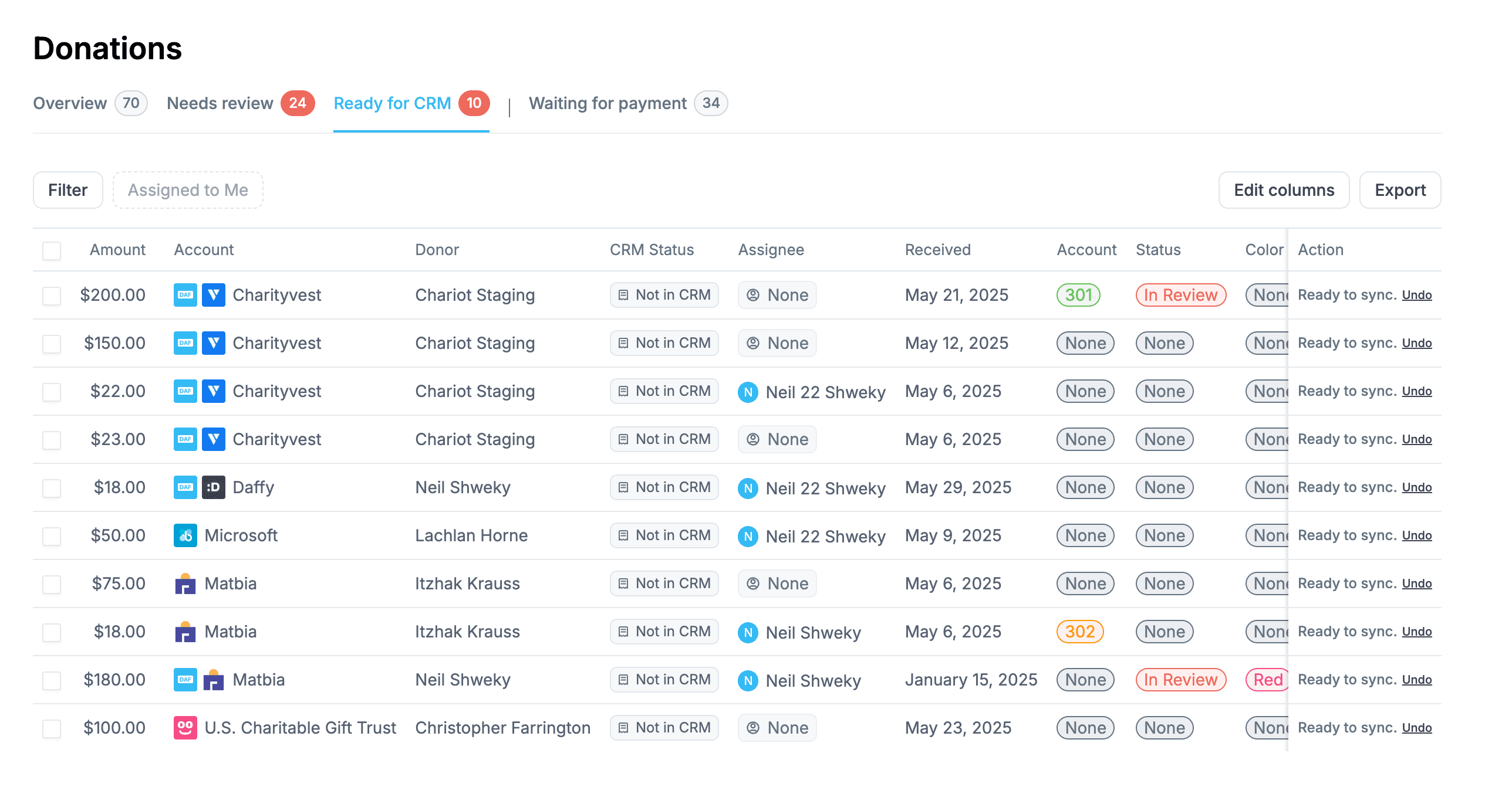
The new navigation answered the question officers repeatedly brought to the work: what needs to happen next?
Four distinct tabs
I organized the interface into Overview, Needs Review, Ready for CRM, and Waiting for Payment so that the navigation represented work state, not data type.
Optimistic updates
When an officer moved a donation, the interface updated the affected workflow view and counts immediately instead of waiting for the request to complete.
Contextual detail panel
A side panel kept the selected donation beside the task list and exposed an Undo action after a state change, preserving context during repetitive work.
A status change affected the whole workflow
The main frontend challenge was keeping the interface coherent when a donation moved between stages. The selected row, the active list, destination counts, and the officer's sense of progress all depended on the same action.
I implemented the transitions in React and TypeScript with optimistic updates so the visible workflow changed immediately. Counts stayed aligned with the new state, and an Undo action gave officers a clear recovery path without forcing them away from the task list. That behavior mattered because officers repeated these decisions throughout the day; making every action wait for a full round trip would have reintroduced friction into the new workflow.
Time on task fell from 5–7 minutes to about 3
After implementation, I worked with nonprofit officers to time donation processing and gather qualitative feedback. The result is best read as task-level validation: officers completed the workflow in one interface and spent roughly 40–60% less time per donation.
- Processing time: 5–7 minutes to about 3 minutes per donation, a roughly 40–60% reduction
- Workflow consolidation: Excel, Salesforce, Word, and DAF portals replaced by one task-focused interface
- Operational reach: hundreds of nonprofits processing thousands of donations each month
”The workflow feels natural now — I don't have to remember where I left off because everything is organized by what needs to happen next.”
Development officer after changes were implemented
What I carried forward
The first version was technically sound because it represented the transaction data accurately; however, it was still the wrong product model. It left officers to translate that convoluted data into a workflow themselves, often times which was the problem to begin with! The redesign worked because the research changed both the information architecture and the state behavior I implemented in the frontend.
Decisions I would repeat
- Model the work before the interface: the transaction schema was a useful engineering model, but it was the wrong organizing principle for officers
- Treat status changes as workflow transitions: one action had to update the donation, its surrounding list, and the counts that kept officers oriented
- Validate the task, not only the screen: time-on-task exposed the value of the redesign more clearly than reactions to a polished interface
What I would measure more deliberately
The time-on-task result established a useful directional signal. In a future iteration, I would define the validation plan earlier and report the participant count, task conditions, error rate, and longer-term adoption alongside processing time. That would make the result easier to interpret and reveal whether the faster workflow remained reliable as more nonprofits adopted it.